Simple Mode (UI Guidance)
The Simple Mode provides a user-friendly interface with UI guidance to help you build and manage your data projects without needing to write code manually. This mode is activated by clicking on the mode toggle.

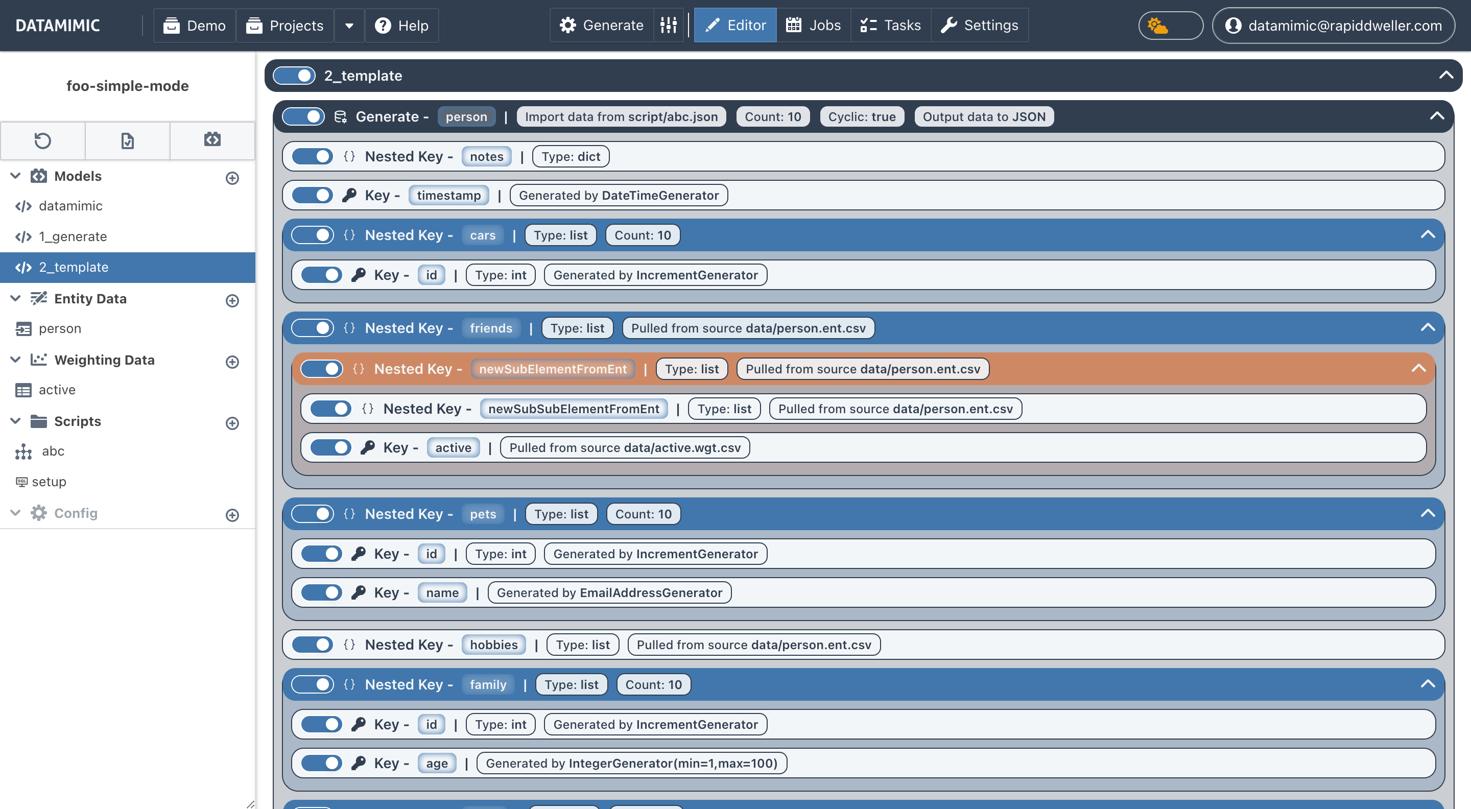
Features
Add Child or Properties of Element
In Simple Mode, you can add new property or child elements at each level by clicking the + icon which is shown when you hover a specific element. The options for adding a property or child will appear in a dropdown menu.
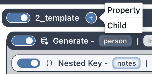
Adding a Child
To add a child element, click on the + icon next to an element and select "Child" from the dropdown menu. This will open a dialog where you can choose the type of child element to add.
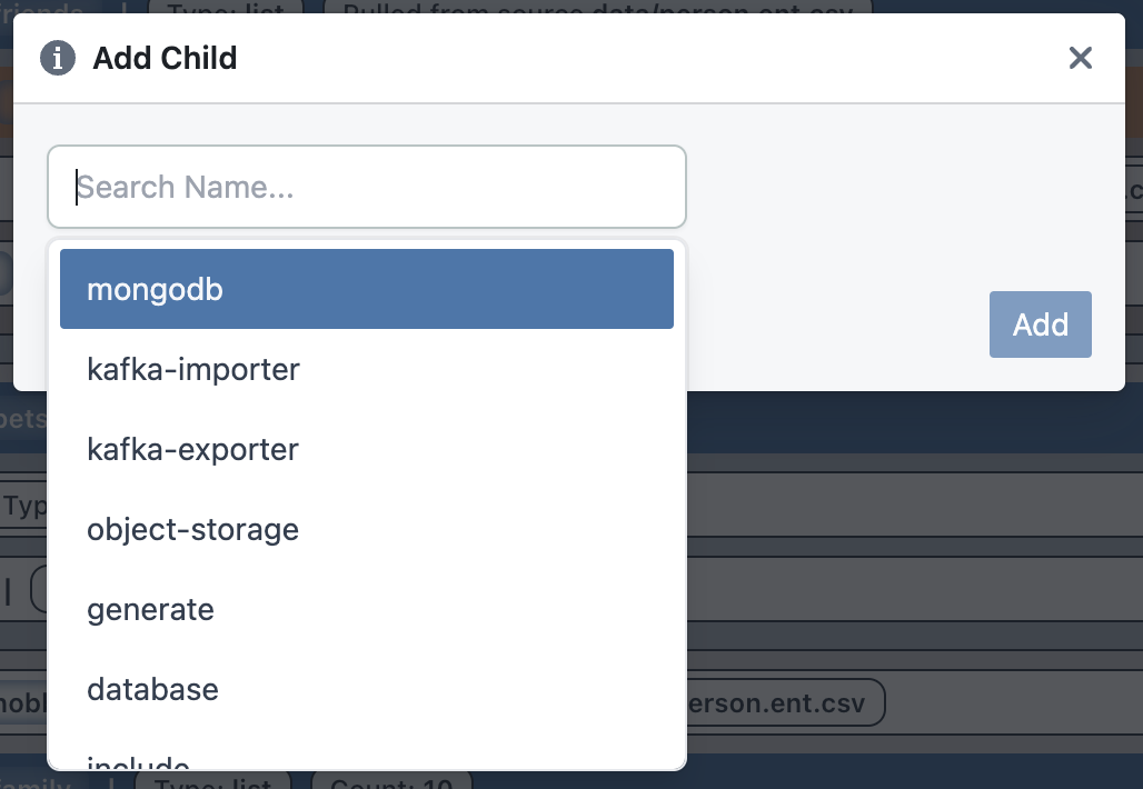
Child elements represent nested elements within the parent, such as generated keys or columns for SQL generation.
For more information about the values for child elements, refer to the Model Documentation.
Adding a Property
To add a property, click on the + icon next to an element and select "Property" from the dropdown menu. This will open a dialog where you can specify the property name and value.
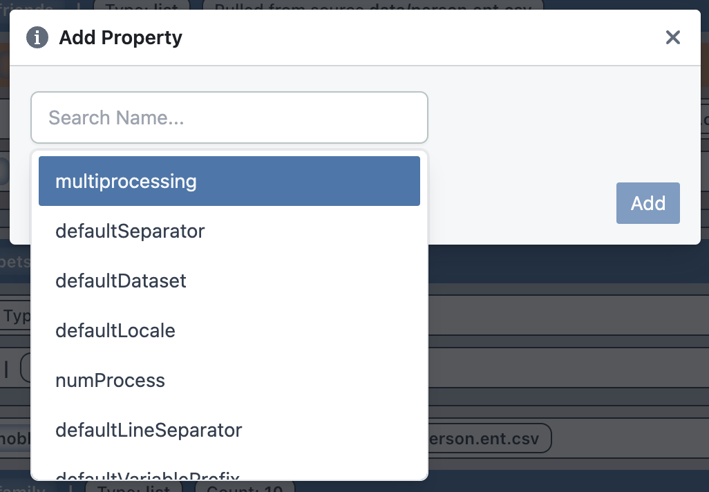
Properties define specific attributes for an element, such as its name, generation count, source system, or target system.
For more information about the values for properties, refer to the Model Documentation.
Note
The available options for properties and child elements are context-sensitive, meaning they depend on the selected element and its context within the data project.
Element Tools
There are two interactive features for managing elements within the interface: the Delete Button and the Disable/Enable Toggle.
Delete Button
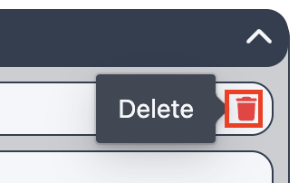
The Delete button is a trash icon that appears on the right side of an element when the user hovers over it. This feature allows users to permanently removes the selected element from the interface.
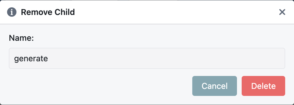
The confirmation dialog contains two options:
- Delete: If you confirms, the selected element is permanently removed.
- Cancel: If you closes the dialog without confirming, the element remains unchanged.
Disable Button

The Disable/Enable Toggle is a switch located at the first position on the left-hand side of the element. It allows users to temporarily disable or enable interaction with the element.
When you clicks the Disable button, the element becomes greyed out, indicating it is disabled and temporarily disables the selected element, preventing further interaction until re-enabled..
While the element is disabled:
- You cannot add properties or children to the element.
- You cannot edit existing properties or children.
- You cannot delete the element.
When the Enable button is clicked, the element is restored to its active state, allowing full interaction again.
Drag and Drop
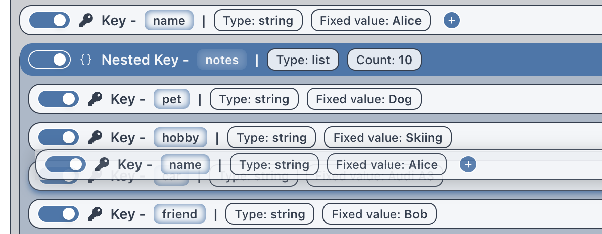
This feature enables users to rearrange tree elements within a hierarchical structure by dragging and dropping. Elements can be moved alongside their peers or nested under a parent element, allowing for flexible reorganization.
Dragging:
Click and hold on a tree element to initiate dragging. While dragging, a visual indicator shows the element being moved.
Dropping:
Release the dragged element at the desired location within the tree. The element can be dropped:
- Within its peer group: To reorder it among its siblings.
- Under a parent element: To nest it under a different parent element.